I was commissioned by American Express to interpret their cards including their Classic Green, Gold and Platinum Cards. To develop three visually stunning and contemporary designs I worked closely with creative agency ALLDAYEVERYDAY


PROCESS
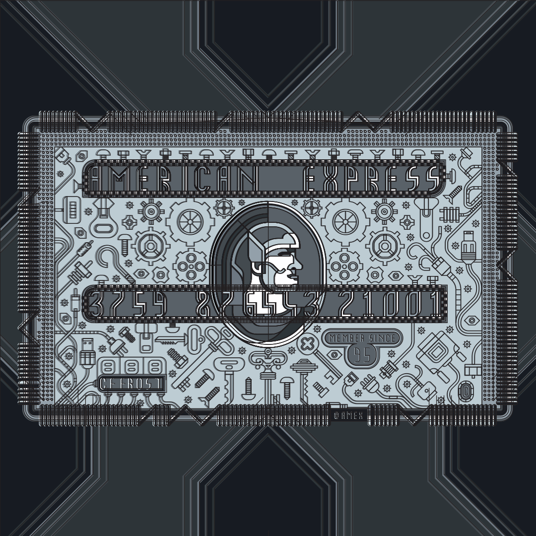
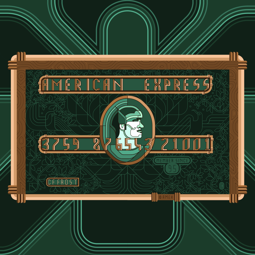
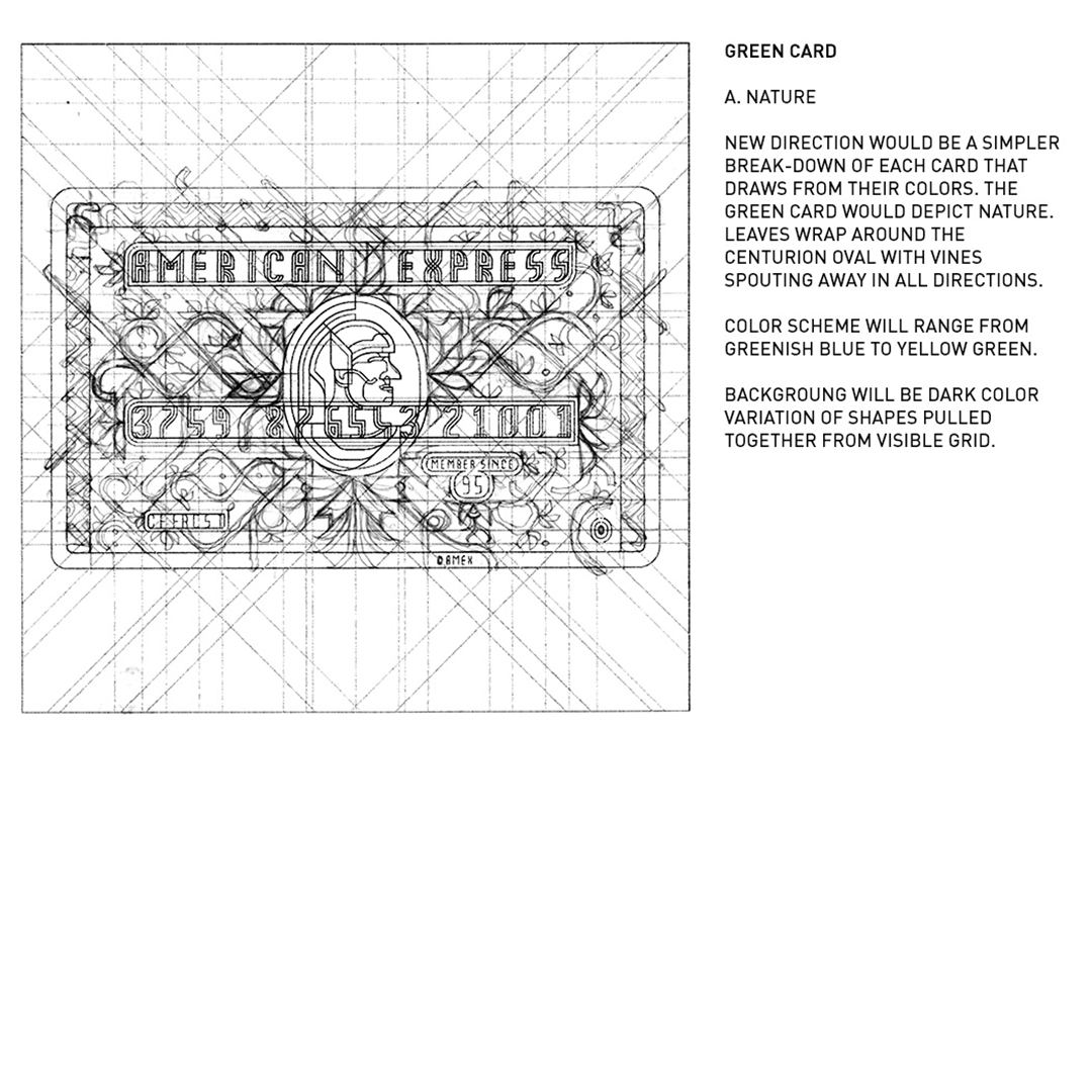
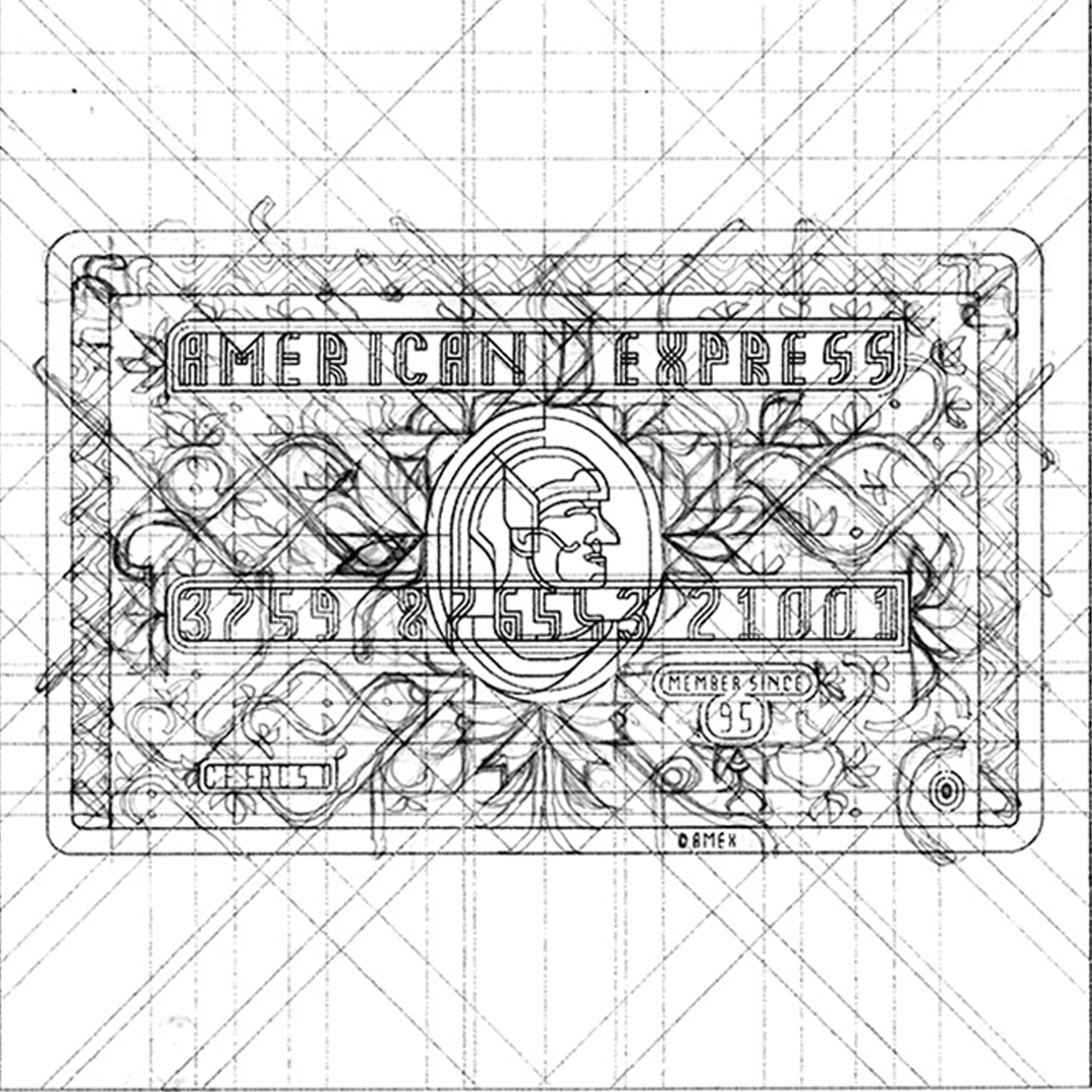
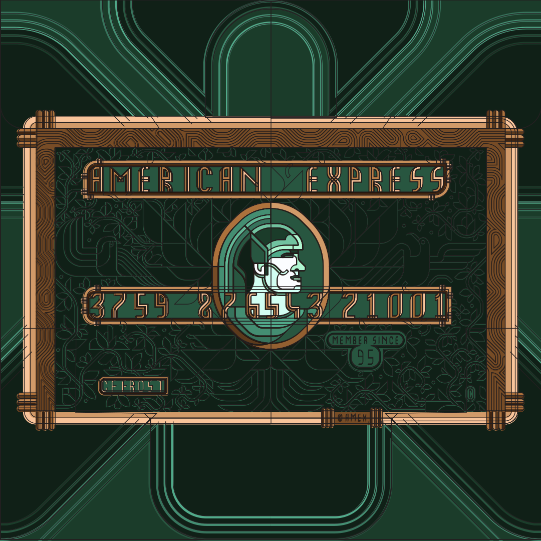
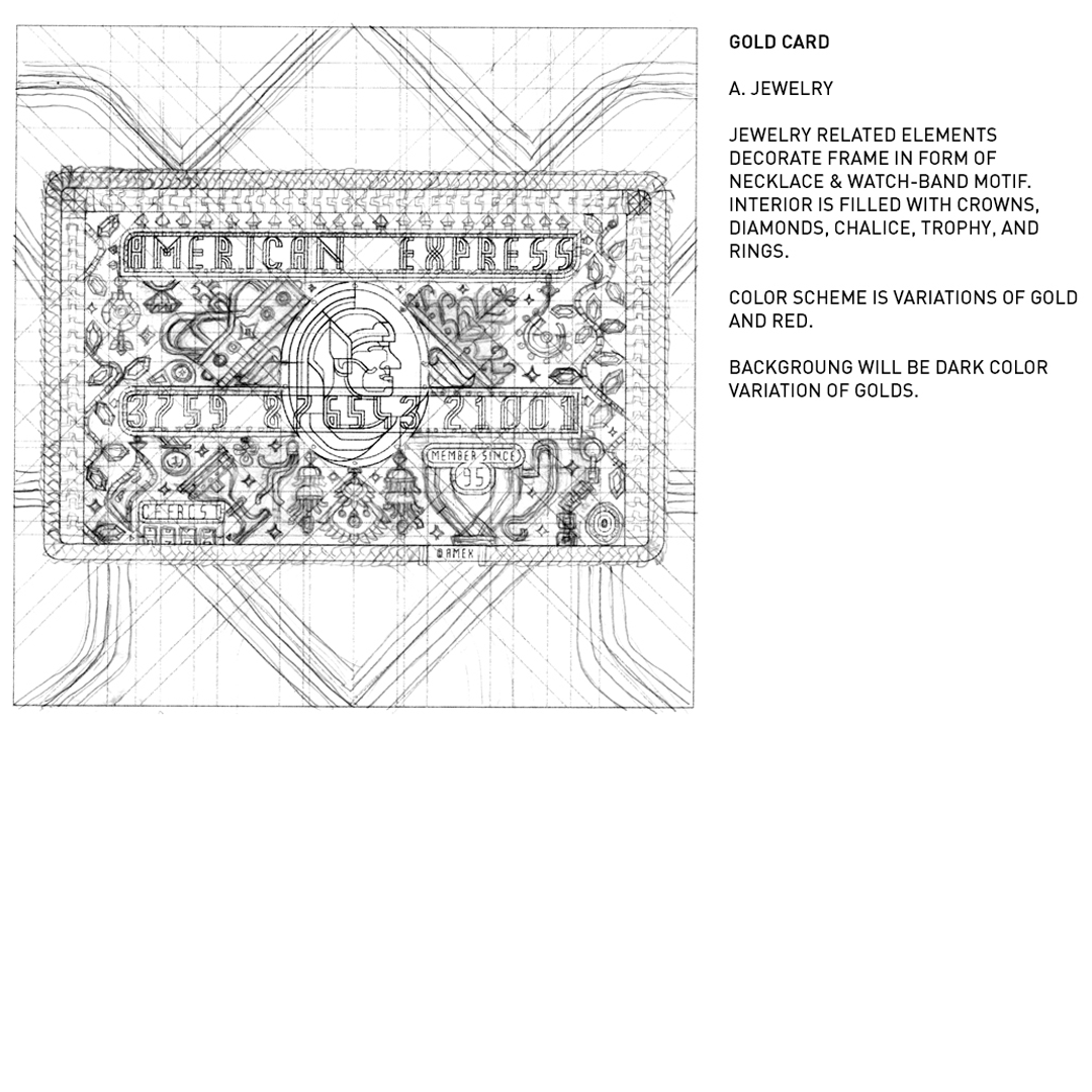
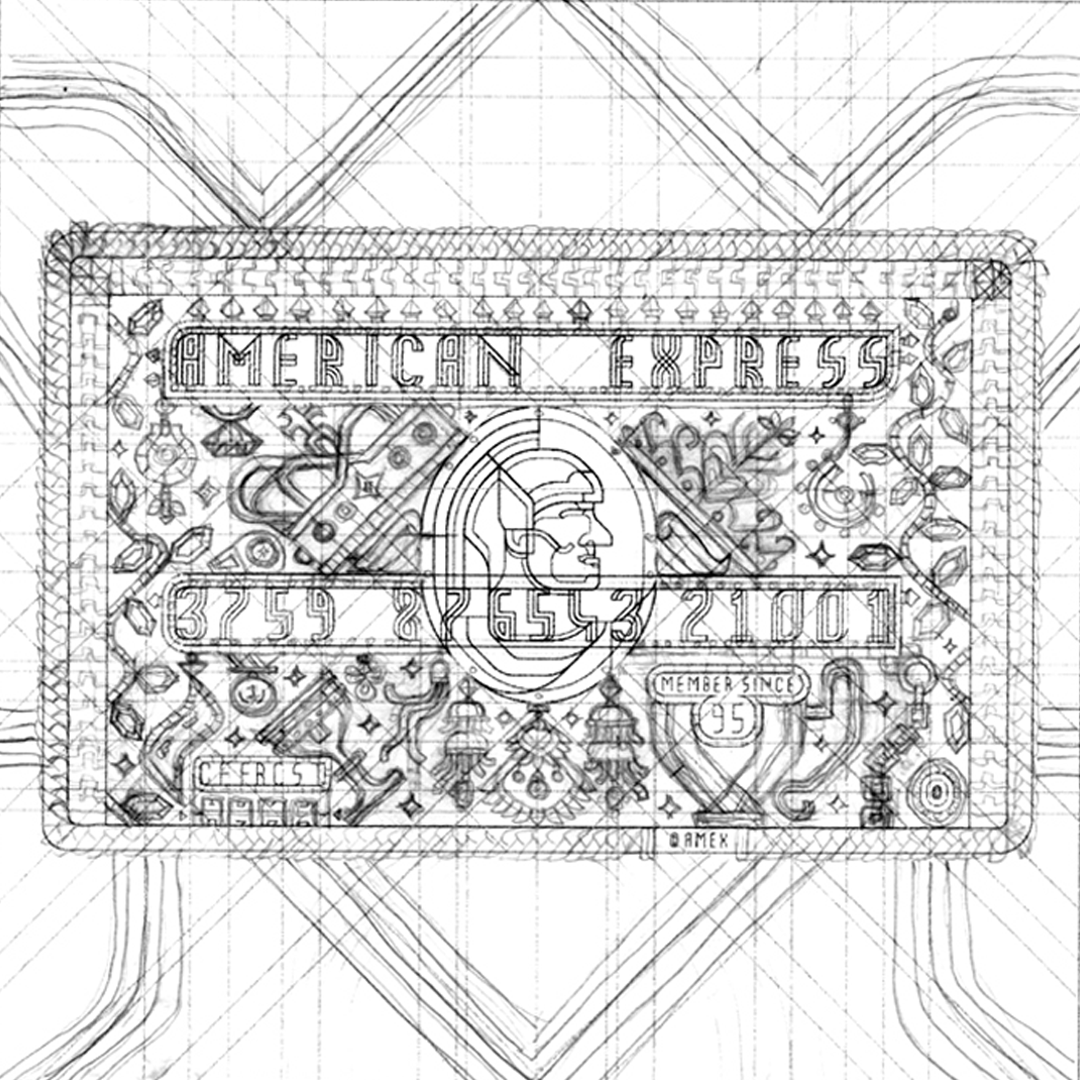
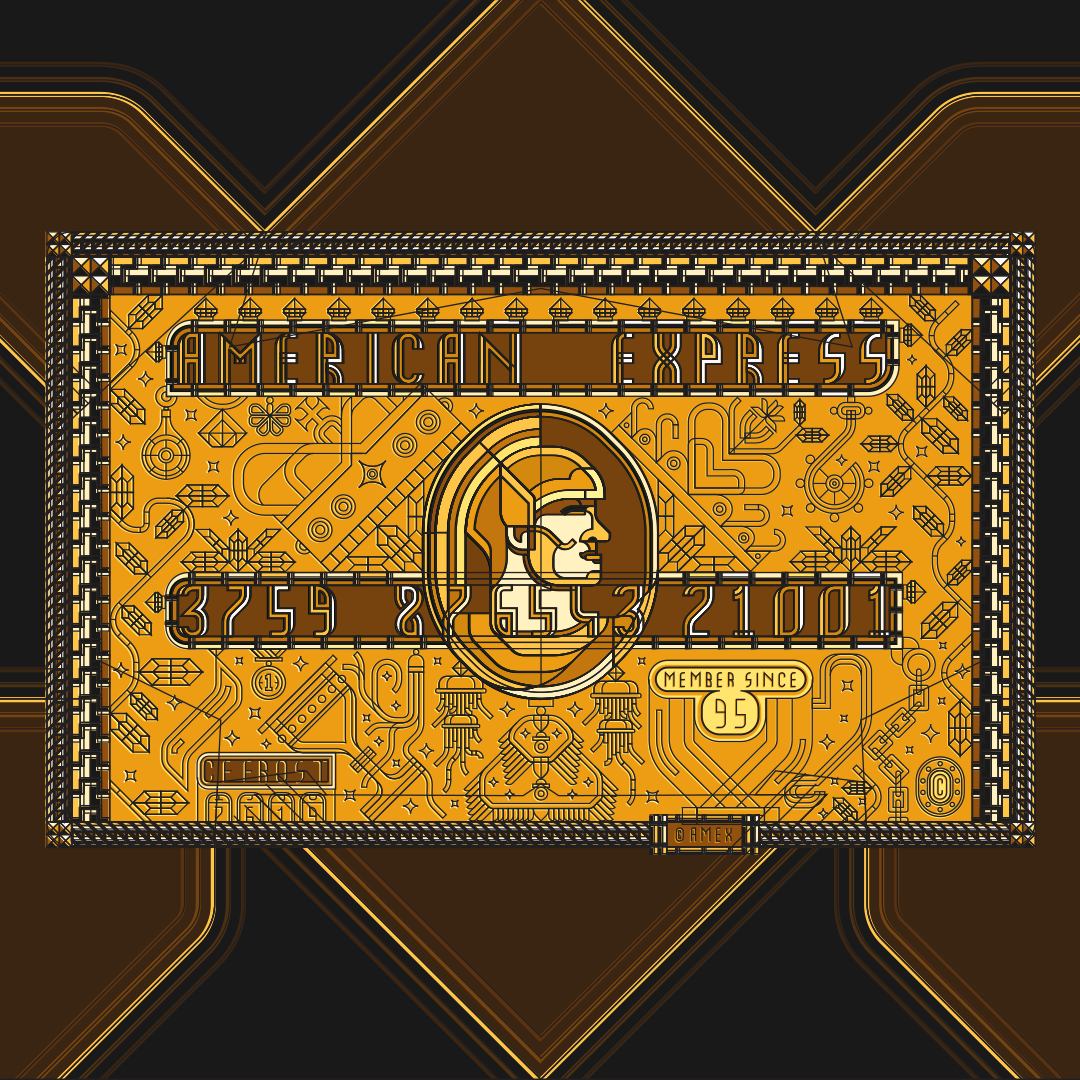
My ideation process was essentially about using the colors of each card to create a common theme. For the Green Card I chose nature; forest, trees, leaves, etc. For the Gold Card, I focused on jewelry; necklaces, rings and general opulence. Finally for the Plantium Card I chose the theme of metals and steels so bolts, chains, wire and various cables.
I wanted to approach these interpretations the same way I do with every project with the same ontological emphasis on re-imaginng the framework of the design and structuring with a specific hierarchy.
STEP 1
For me it's important every piece has its own recognizable framework in which all elements are grouped and exist relating to a specific hierarchy. I structure my hierarchies into
1. General Grid - the overarching foundation that holds everything together and creates a sense of unity
2. Principles - key elements that determine or are foundation for creation of the General Grid
3. Proletariats - all other elements small or otherwise that fill in existing design or realy give the design a sense of wholeness. Usually these are the majority of visible design elements. (Note: It's really the word that helps me remember and designate that these elements are doing much of the visible work)
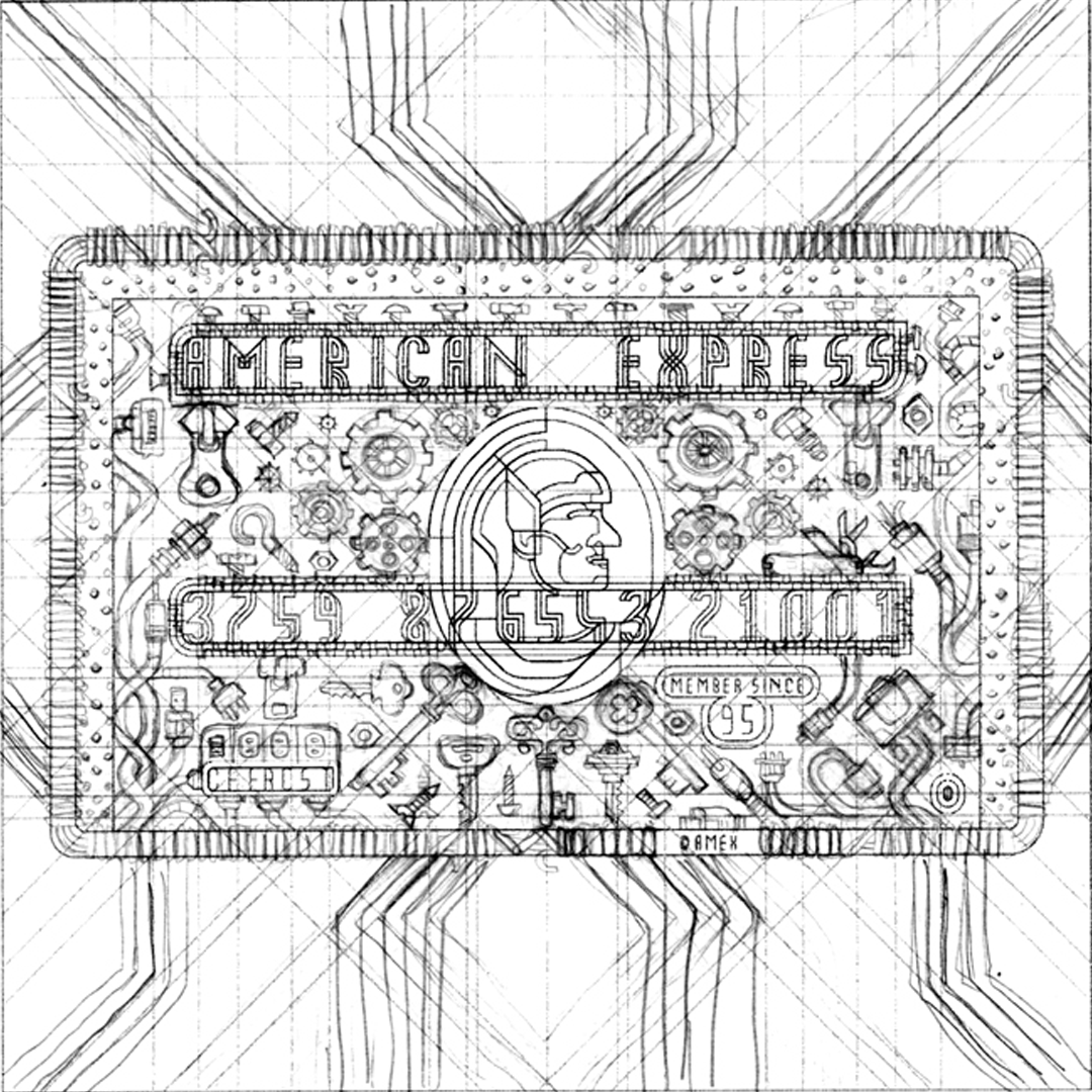
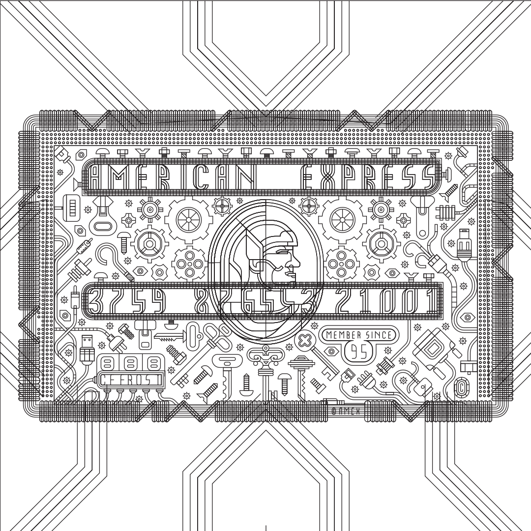
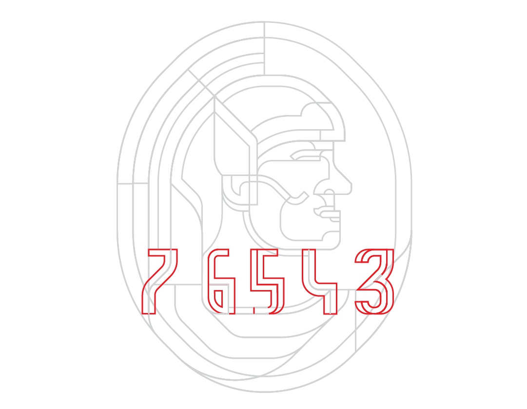
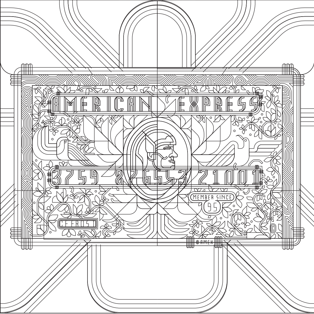
To create the hierarchy I first select the principles (focal point of the design) and determine initial grid to dictate the remaining design. The Centurion is the center piece of the original Amex Card Design but I found it more important to allow the numbers to feel part of the whole instead of separate design elements that just look slapped onto it. Part of my approach is to flatten a design and not give more structural emphasis to one design element than the other.
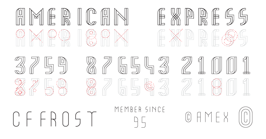
For this purpose I created a new font that simultaneously fits the means of how I approach the shapes and lines and compliment the rest of the design in its structure.
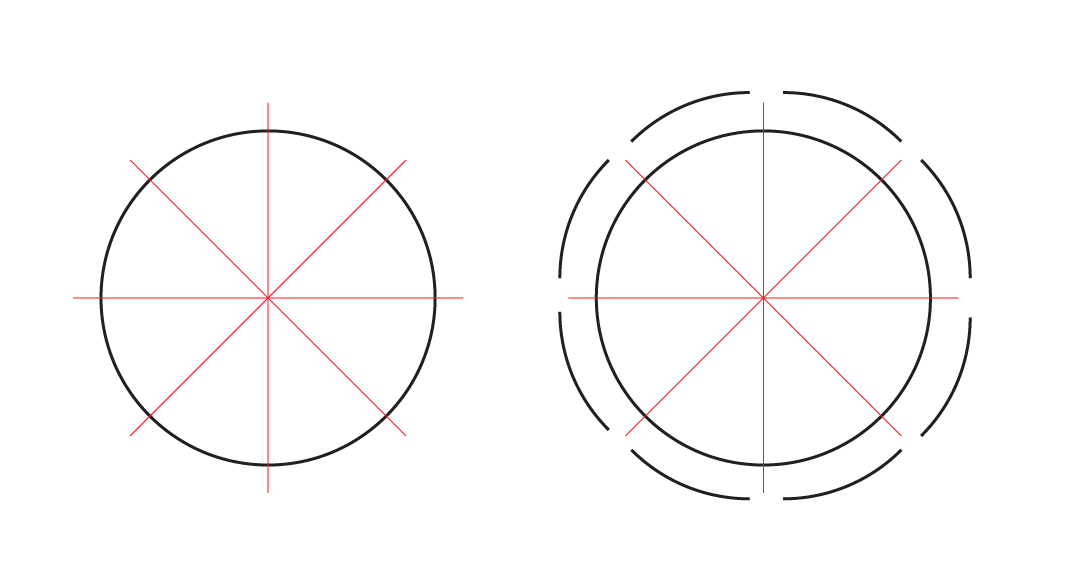
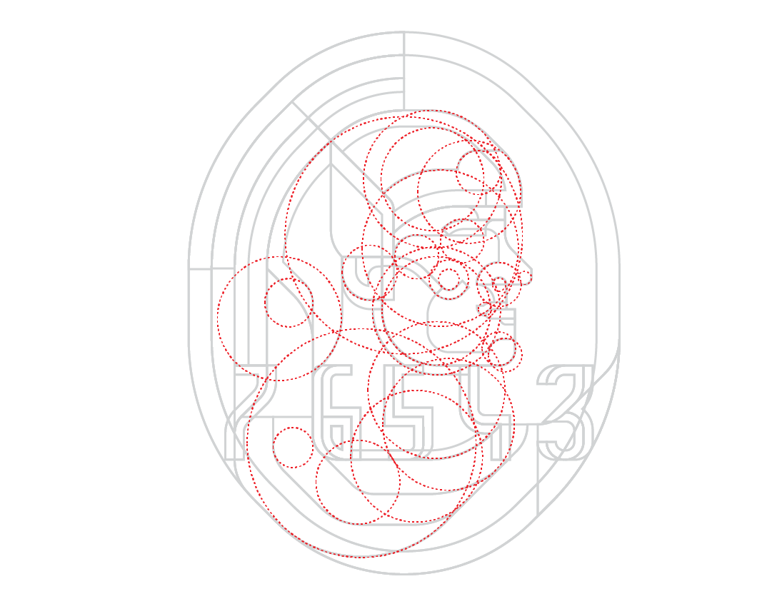
RULE OF EIGHTS
I approach every design of mine with the same philosophy of only using 45 degree angles. When I limit myself I often find I reach far more creative solutions. This also ensures for a more unified look to function within the designated grid and framework. Two key factors determine successful use of Rule Of Eights. One is to only use eights of a circle (pictured below) and straight lines to construct any given shape. Secondly and most importantly is to never allow these eights to intersect anywhere outside of their anchor points.
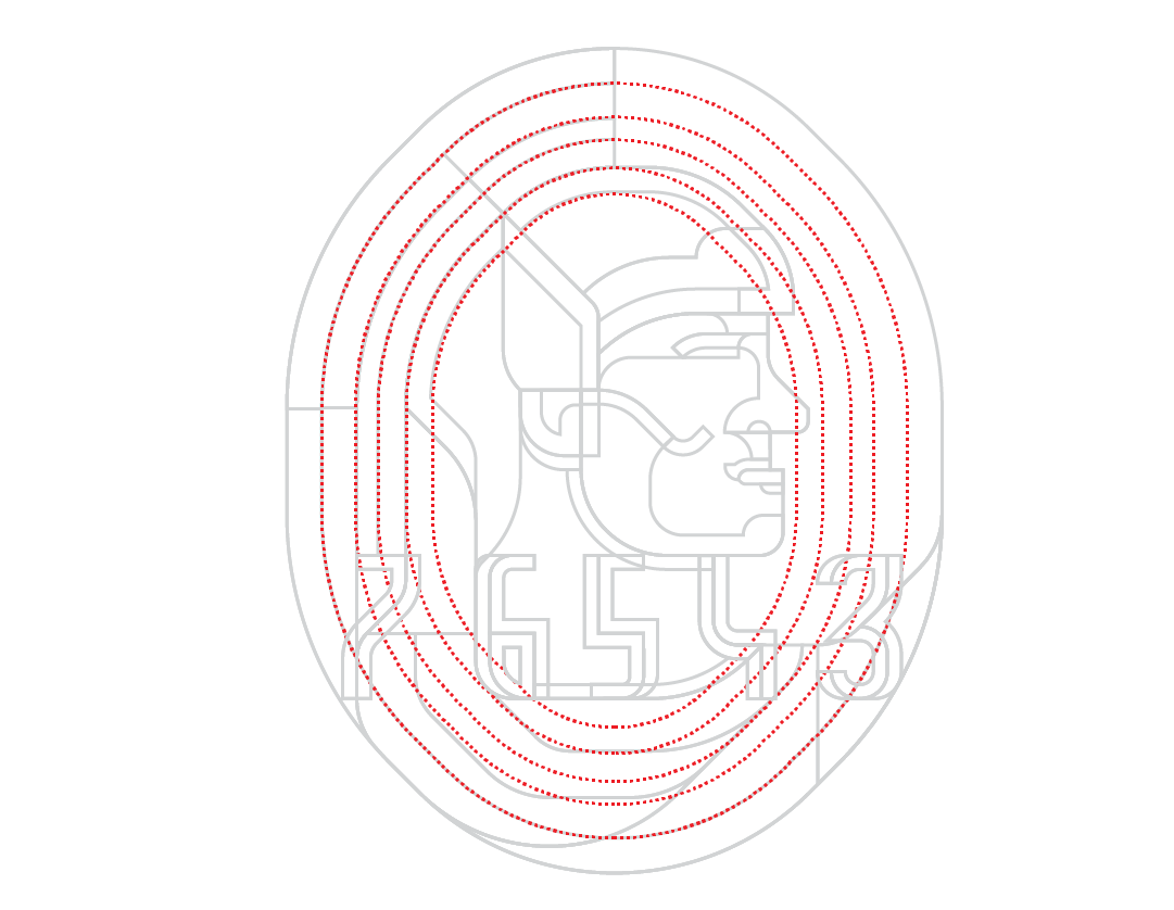
STEP 2
Next in creating the hierarchy is the second crucial element to create the grid; the iconic Centurion. To retain a likeness but avoid a literal interpretation I employed again the use of my rule of eights and created the profile view from the oval that frames it. Since the numbers overlap the oval it was essential to create the Centurion with the numbers part of its own framework.
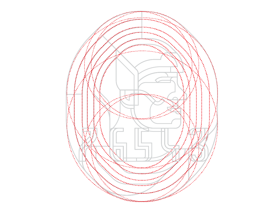
STEP 3
Finally it was time to create the General Grid, which is the designated larger grid that will inform the Proletariats design such as the interior decorative illustrations as well as the backgrounds. The General Grid can be created from either of the principles. In this case I chose the central Centurion. Again, the grid is made up entirely of the tules of eights - lines primarily at 45 degree angles. And here they only eminate at the anchor points of the oval. From here on I can I had the freedom to return to the ideation process and start drawing the aforementioned elements.

GREEN CARD
GOLD CARD

PLATINUM CARD